Timeframe: 15 hours over 3 days from start to finish.
Tools: Sketch, Principle, Adobe After Effects.
Prompt: Design a standalone bill splitting app for iOS or Android that addressed the following:
Ability to split bill and tip with multiple people
Ability to specify tip amount or percentage (ex 10%, 15%, 20%)
Be creative with what features, if any, you decide to include
RESEARCH
INITIAL THOUGHTS
I firmly believe that design is meaningless if not contextually driven.
As such, every decision in my design process needs to be a result of understanding the user and the context that it lives in.
To kickstart my process, I outlined the following questions to learn, validate and disapprove any assumptions that I may have:
In what context does one split a bill?
What tools do they use to split bills? What are the current frictions?
What factors that matter the most when it comes to splitting a bill?
What is the user’s end goal?
How might we minimize the number of steps it takes to achieve the end goal?
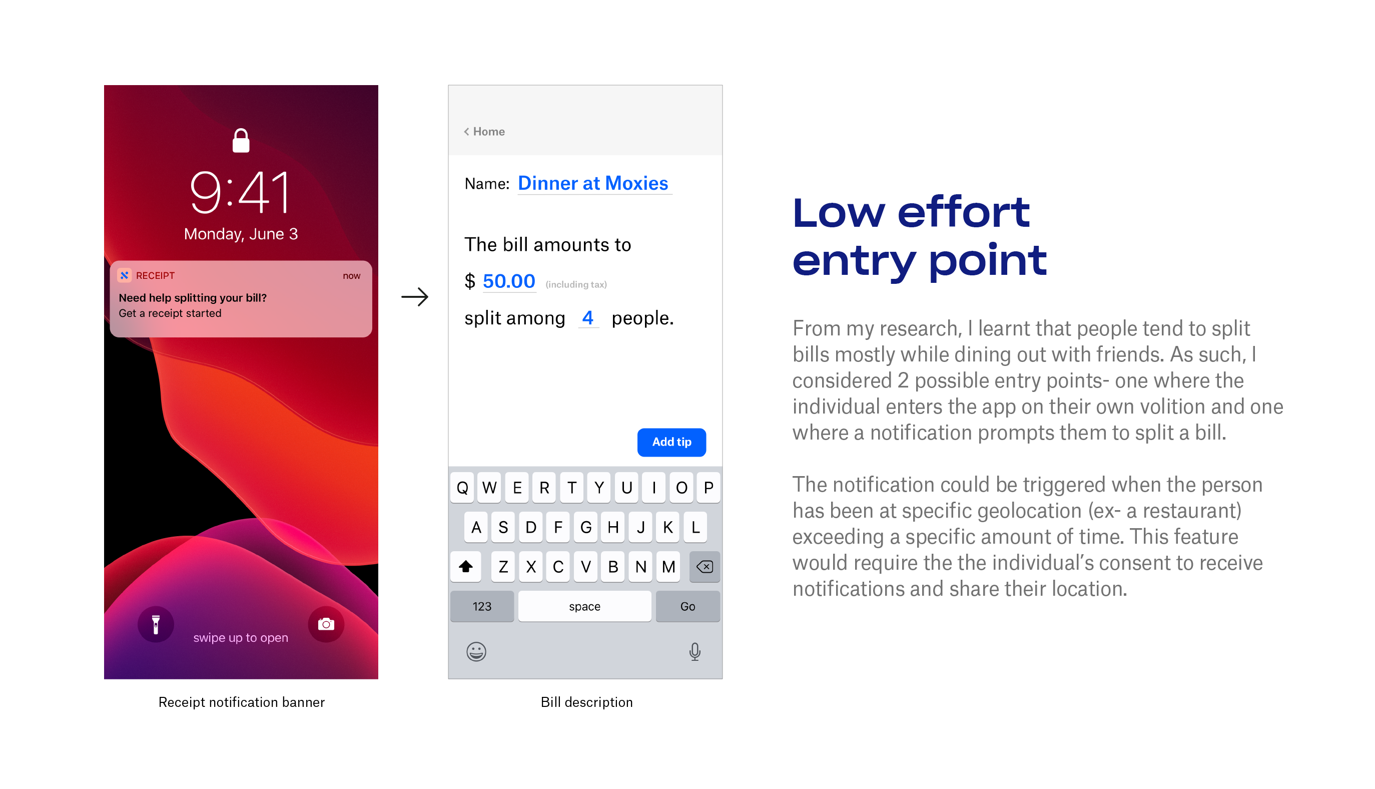
What is the most intuitive and low-effort entry point into this app?
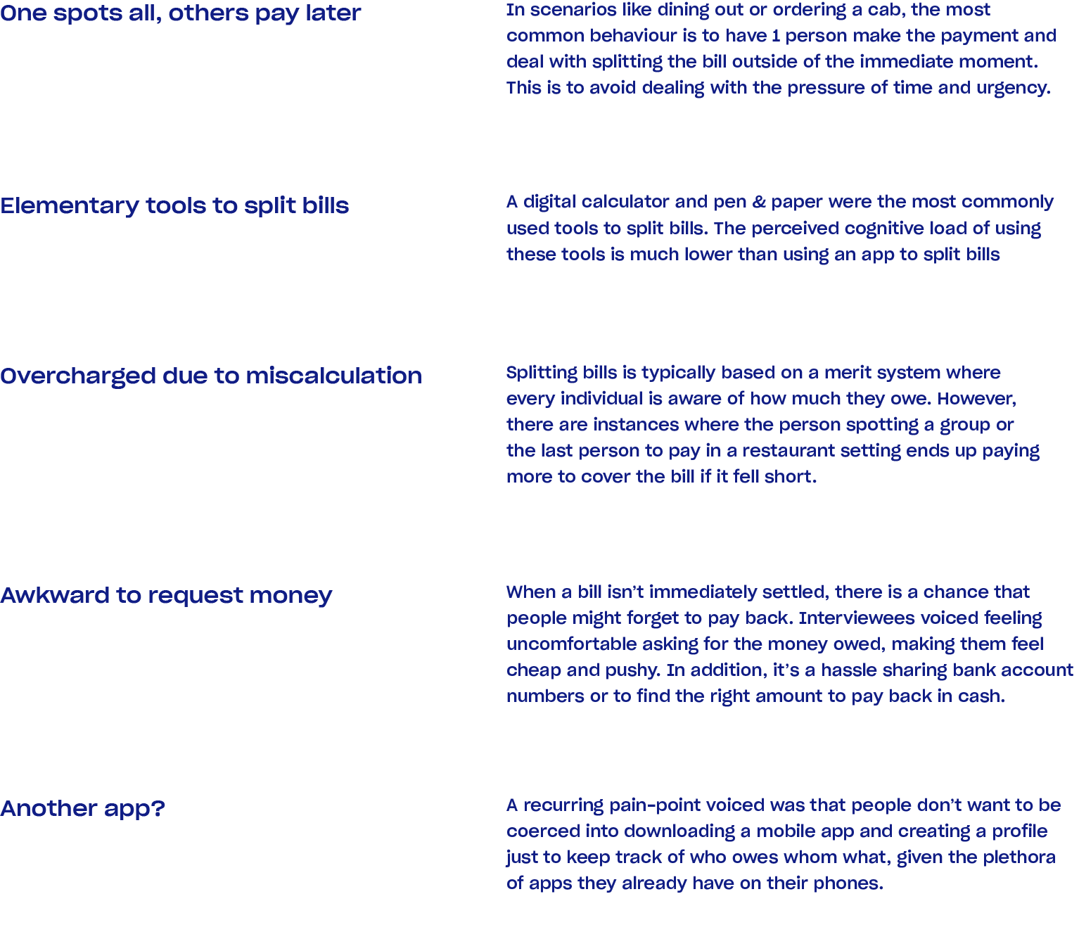
INSIGHTS
To ground my research in real-life scenarios, I conducted interviews with friends to understand what their experience has been with
splitting bills. From these conversations I gathered the following insights:
I quickly realized that the existing applications don’t offer anything more than an intuitive calculator
however a significant part of this experience extends to until all debts have been settled and people have been paid back.
Based on my research I reframed the initial question of “how might we create a simple and intuitive way to split group expenses?” to:
“How might we design for an end-to-end seamless flow that alleviates the current fragmented experience of splitting and paying bills?“
IDEATION
My main goal while ideating was to make the experience seamless, quick, and efficient.
As I started to work out the user flow for this application, I realized several different use cases for a bill splitting app.
(Challenge) I found myself coming up with several ideas that addressed the pain-points highlighted in my research.
For example, one friction I picked up on was the inconvenience of passing the paper bill around for people to determine their share,
while others wait patiently for their turn. I wrestled with the idea of using computer vision technology to scan and read receipts,
to minimize user input while leverage existing technology. However, realizing that this is a standalone bill-splitting app,
I reasoned that such technology wouldn’t be very feasible, and doesn’t adapt to existing user behaviours.
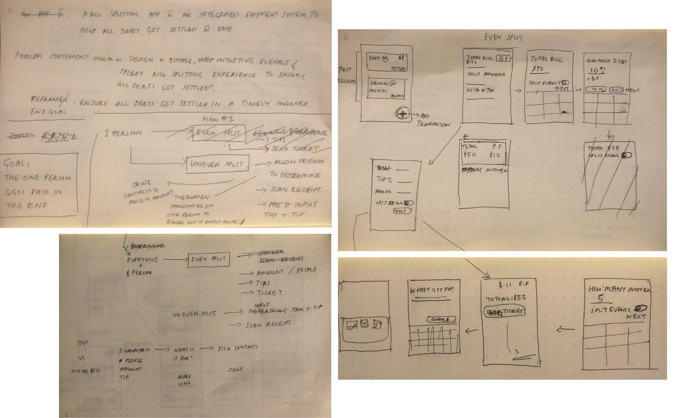
Working out the logical app flow
I had to scope down and create constraints for myself to prevent this app from being a feature-heavy application.
I wanted the app to stay as close to the real-life bill splitting experience where it would zone into a specific user
need and serve as a touchpoint to ease frictions rather than adding more tasks for the user.
I chose to design an app with the following constraints:
Transaction specific bill-splitting rather than incurring and incremental expenses overtime.
Only one individual would need the application downloaded.
Medium fidelity wireframes
As I moved from pen & paper to medium-fidelity and eventually to high fidelity wireframes,
I became aware of some flaws in my logic flow which required me to constantly iterate on the screens.
I continuously looked for ways to make the flow as concise and intuitive as possible-
combining screens and taking out UI elements unnecessary to achieve the end goal.
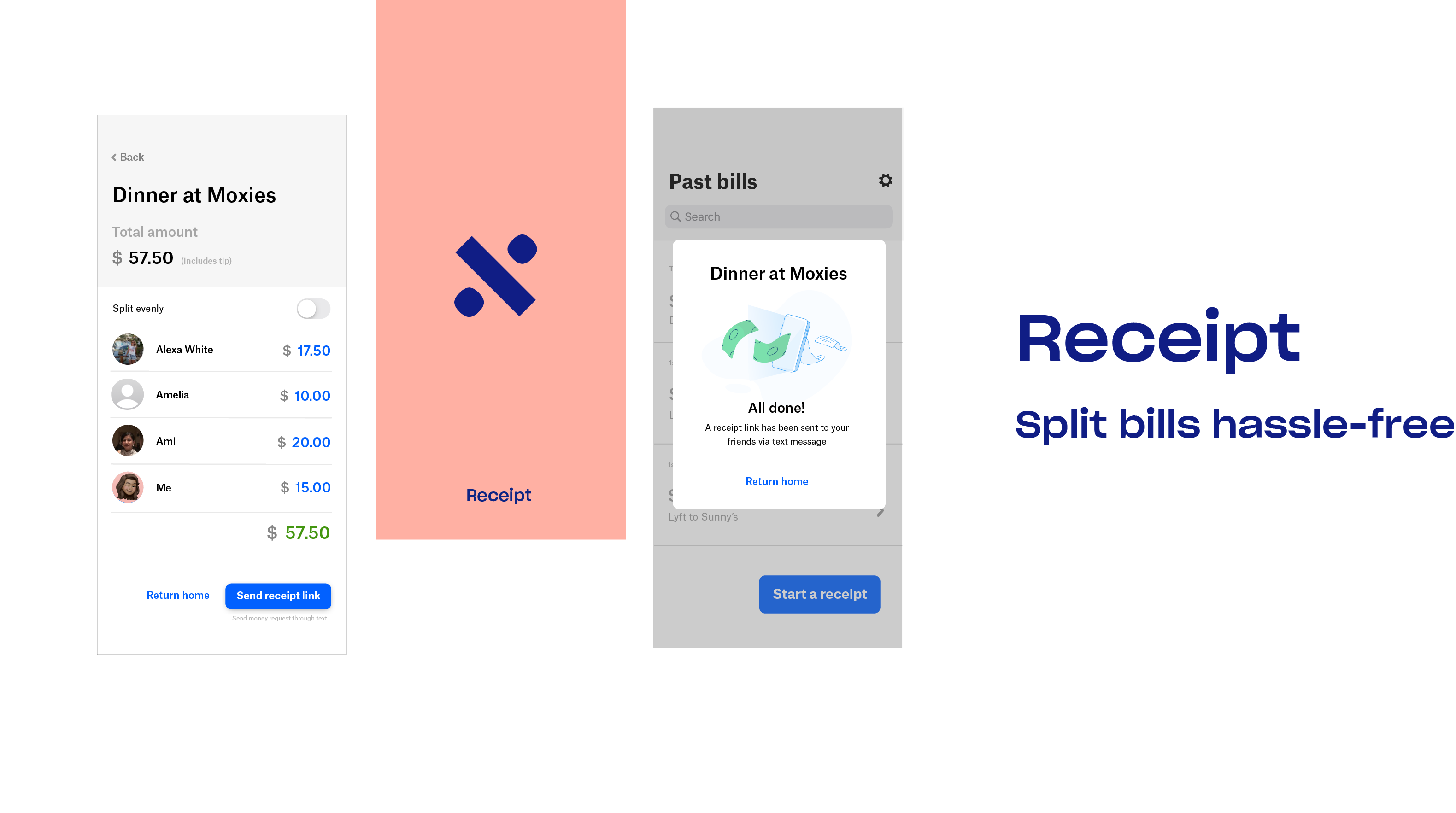
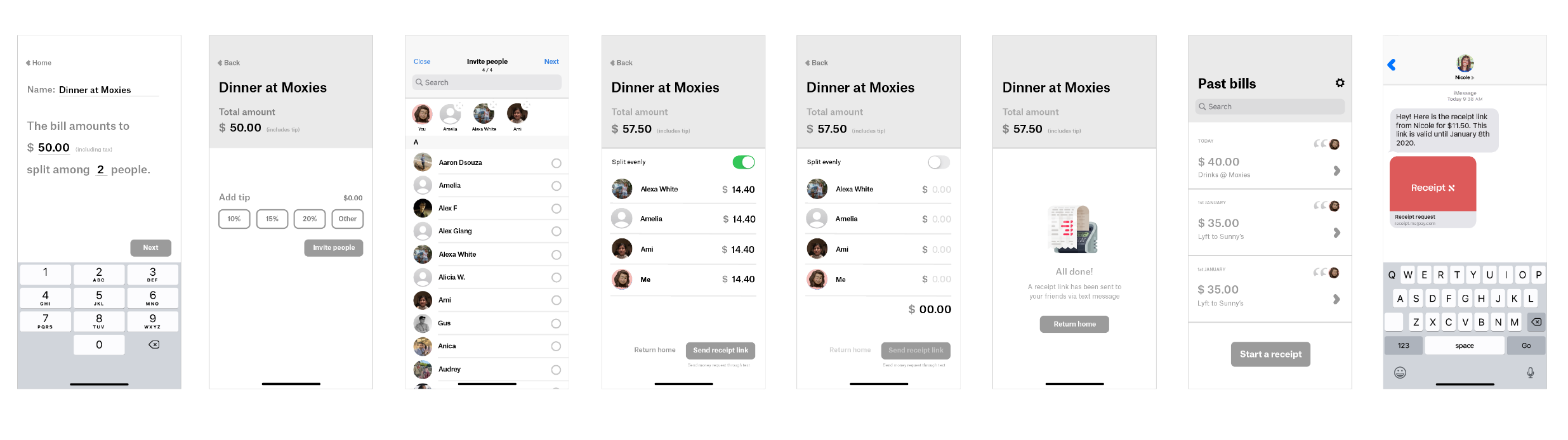
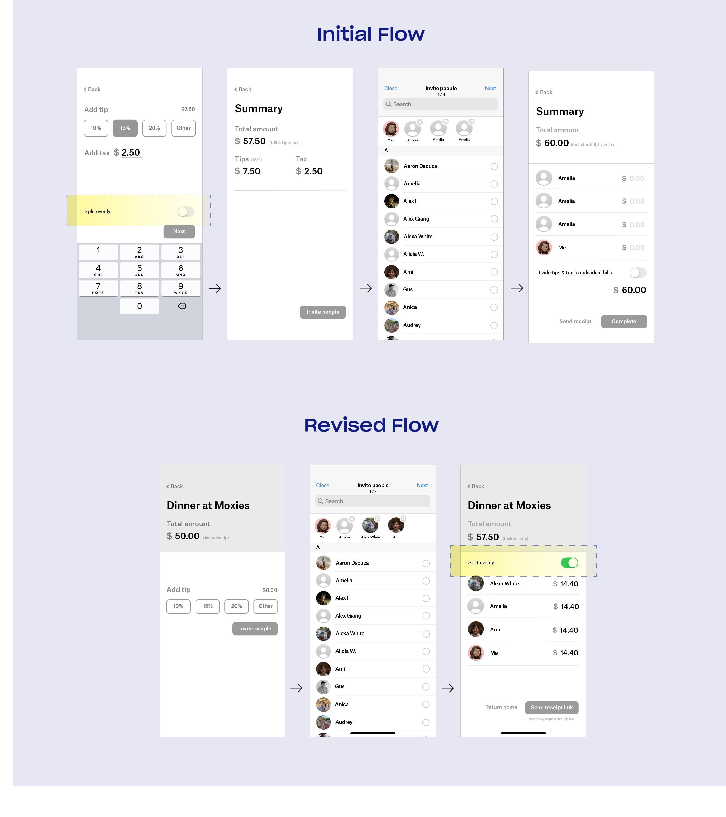
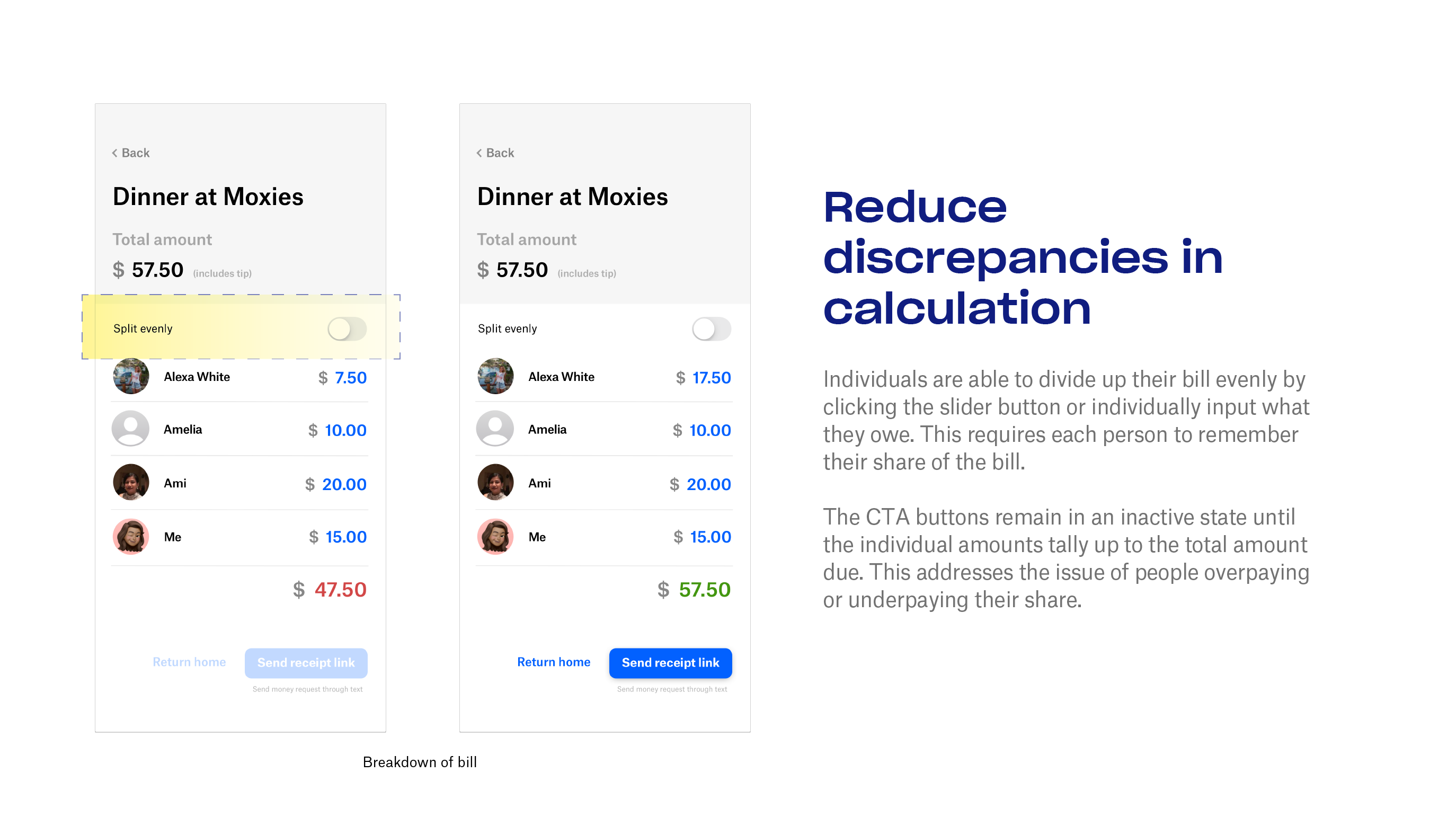
(Challenge) In the initial stages of the design, I broke down 2 separate contexts for splitting the bill —
split evenly or get each person to input their amount. With this mental model,
I created 2 separate flows that were determined based on the user’s input in the “Add tip” screen (see image above).
I realized that this was adding unnecessary complexity and offered little flexibility to the user if they changed their mind,
needing them to click “Back” twice to change their input.
Additionally, moving the option to “Split evenly” in the summary screen is more visually contextual, easing their decision-making process.
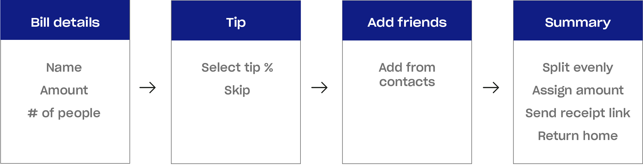
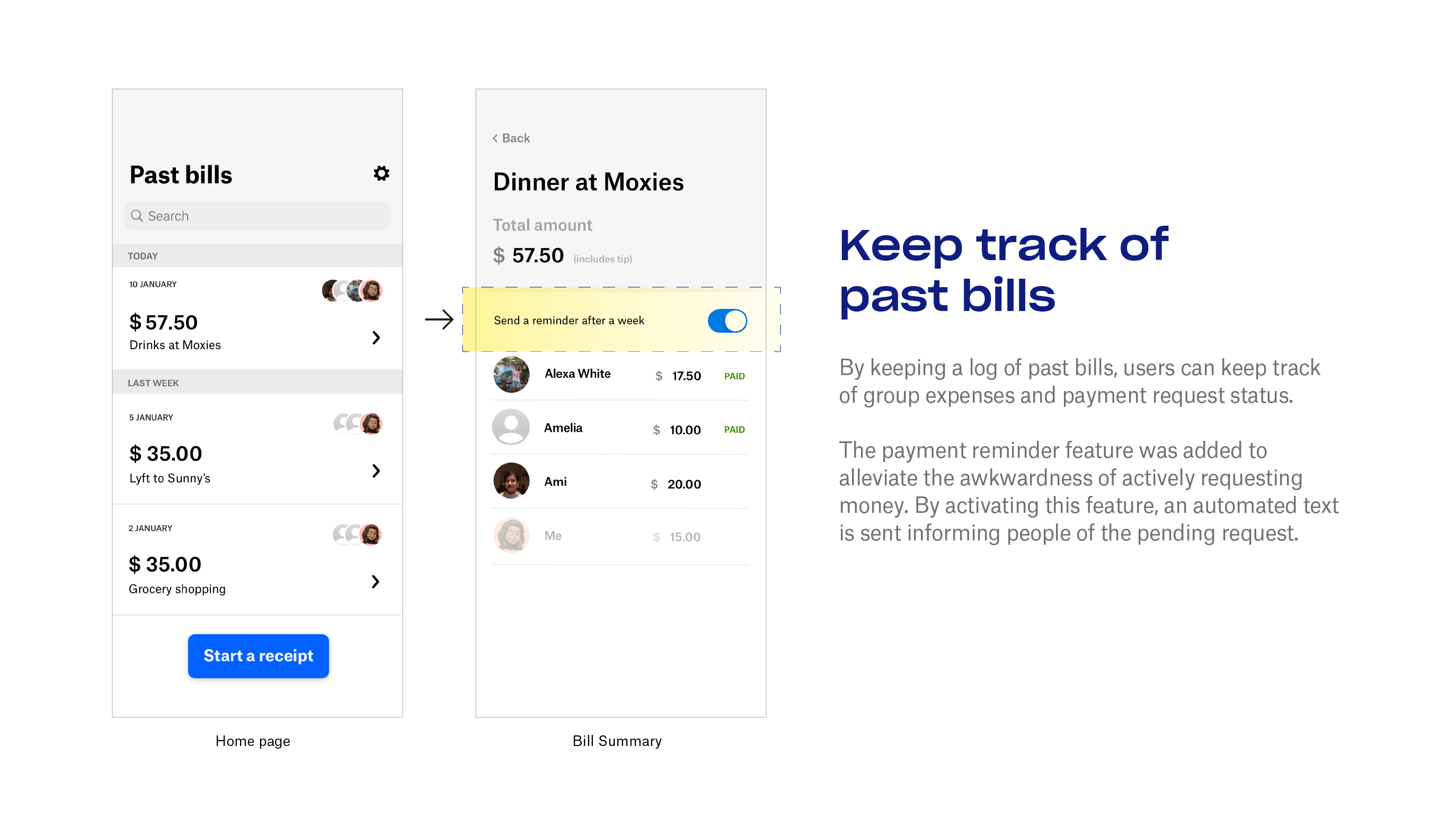
Finalized app architecture
APP WALKTHROUGH
Here is a quick application walkthrough video that I made to demonstrate how the user flow
TECHNOLOGY
In Canada (where Venmo isn’t available), people are increasingly transferring money online through their banking apps that use Interac e-Transfer.
Utilizing Interac’s API, this service would be able to work cross-functionally between different Canadian banks,
eliminating the need to input your friends’ banking information to be able to send a money request.
This also reduces the cognitive load for the individual owing money, where they are 2 clicks away from transferring money.
CLOSING THOUGHTS
The bill-splitting task is far more complex than I first assumed it to be.
The most challenging part of the process was recognizing that not all use cases can be solved with one app,
especially when prioritizing simplicity and intuitiveness.
I was constantly trying to balance giving users agency while not overwhelming them with too many decisions.
Due to the tight timeframe of this assignment, I prioritized designing screens that would help understand this product’s narrative.
Given more time, the following is what I would work on further:
Design the onboarding screen that helps first-time users understand the end goal of this application and the settings screen where
users can turn on/off locations services and notifications.
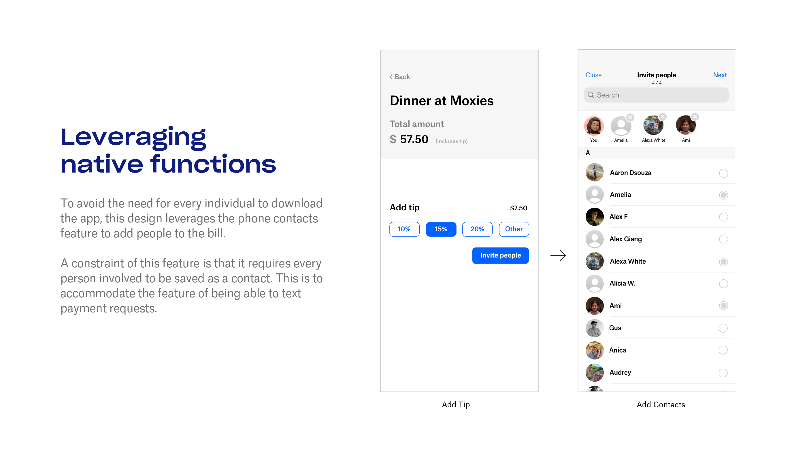
Add options to create a more flexible system. For example, if members of the party are not saved as contacts,
give the user the ability to manually add people to the bill.
Currently, this app works under the premise that everyone agrees on a tip percentage (since it was a group experience).
What would the user flow be if each individual determined how much they tipped?
A nuanced UI design where users are primed and given more control over the text receipt link message prior to it being sent.
Splitting bills can get quite complex and confusing the bigger the party, how would we take that into consideration with the current UI?